

Room color décor trends 2026 are redefining how we think about interiors—moving beyond safe neutrals into layered, expressive, and mood-driven palettes. If your home feels a little outdated or uninspiring, the right color choices can completely transform it without a full renovation.
This guide breaks down the most important color trends shaping 2026, explains why they’re gaining popularity, and shows you how to use them in real rooms. You’ll discover practical combinations, expert tips, and mistakes to avoid—so you can confidently refresh your space with colors that actually work.
In This Article
The Color Shift of 2026: What’s Changing in Home Décor?
Color in 2026 isn’t just about aesthetics—it’s about how a space feels and functions. Homeowners are moving away from purely visual trends and toward emotion-driven design that supports relaxation, focus, and well-being.
From Minimal to Meaningful
Neutral minimalism dominated for years, but now it’s evolving. Instead of stark white walls and cool grays, interiors are embracing:
- Warmer, grounded tones that feel inviting
- Layered palettes instead of flat, single-color schemes
- Personal expression through color choices
Spaces now reflect lifestyle, not just style.
The Influence of Wellness and Sustainability
A major driver behind room color décor trends 2026 is the shift toward healthier living environments. Colors inspired by nature—like soft greens, clay browns, and muted blues—help create calming atmospheres.
Designers are also prioritizing:
- Low-impact, eco-conscious materials paired with earthy colors
- Light-enhancing hues that reduce reliance on artificial lighting
- Shades that promote mental clarity and relaxation
Technology Meets Comfort
Digital life continues to influence color choices, but in a softer way. Instead of harsh neon tones, 2026 introduces:
- Muted tech-inspired colors (like digital lavender)
- Subtle gradients and blended hues
- A balance between futuristic and cozy
The result is a home that feels both modern and livable.

Room Color Décor Trends 2026: The Standout Shades Defining the Year
Some colors are already emerging as clear leaders in 2026. These shades aren’t random—they reflect deeper cultural and lifestyle shifts.
Earth-Infused Neutrals
Expect to see neutrals that feel rich and organic rather than flat or sterile:
- Mushroom gray – soft, warm, and versatile
- Clay beige – adds depth without overpowering
- Sandy taupe – perfect for layering textures
These tones work beautifully as base colors for almost any room.
Deep Nature Hues
Nature-inspired colors are becoming bolder and more immersive:
- Forest green for grounding living spaces
- Ocean blue for calming bedrooms
- Mineral gray for a modern yet earthy look
Used correctly, these shades create a cocooning effect that feels both stylish and comforting.
Unexpected Accent Colors
2026 also welcomes subtle pops of color that feel fresh but not overwhelming:
- Muted coral for warmth
- Digital lavender for a modern twist
- Smoky peach for soft vibrancy
These accents work best in décor elements like cushions, artwork, or statement furniture.
Why These Colors Matter
Each trending shade connects to a broader need:
- Comfort and calm in a fast-paced world
- A stronger connection to nature
- Personal expression without chaos
Choosing the right color isn’t just about trends—it’s about creating a space that feels right every day.
Beyond Beige: The Rise of Complex Neutrals
Plain beige and basic white are losing their appeal. In 2026, neutrals are becoming more nuanced, layered, and visually interesting.
What Makes a Neutral “Complex”?
Complex neutrals have subtle undertones that shift depending on lighting and surrounding décor. Instead of looking flat, they add depth and character.
Examples include:
- Warm gray with hints of brown
- Cream with soft yellow undertones
- Greige blends that adapt to different spaces
Warm vs. Cool Balance
Choosing the right undertone is key to making your space feel cohesive.
| Neutral Type | Best For | Effect |
| Warm neutrals | Living rooms, bedrooms | Cozy and inviting |
| Cool neutrals | Kitchens, bathrooms | Clean and modern |
| Balanced neutrals | Open-plan spaces | Flexible and harmonious |
How to Layer Neutrals Like a Designer
A single neutral shade can look flat, but layering creates depth:
- Combine different shades of the same color family
- Mix textures (linen, wood, stone) to enhance the palette
- Add subtle contrast through furniture and décor
Where Complex Neutrals Work Best
- Living rooms: create a warm, welcoming base
- Bedrooms: build a calm, relaxing atmosphere
- Small spaces: add interest without overwhelming the room
A well-chosen neutral palette acts as the foundation for all other décor choices, making it one of the smartest ways to embrace room color décor trends 2026.
Biophilic Color Design: Bringing the Outdoors In
Nature isn’t just an inspiration in 2026—it’s the foundation of many interiors. Biophilic color design focuses on reconnecting indoor spaces with the calming, restorative qualities of the natural world.
Why Nature-Inspired Colors Are Everywhere
Spending more time indoors has shifted priorities. People want homes that feel:
- Relaxing instead of stimulating
- Grounded instead of artificial
- Connected to the outdoors
That’s why palettes rooted in greens, browns, and soft sky tones are dominating room color décor trends 2026.
Popular Biophilic Color Schemes
These combinations feel organic and easy to live with:
- Layered greens (sage, olive, moss) for depth
- Earth gradients (clay, sand, terracotta) for warmth
- Sky-inspired tones (soft blue, mist gray) for calmness
Instead of sharp contrast, the goal is flow and harmony.
Pairing Colors with Natural Textures
Color alone won’t achieve the full effect. The magic happens when paired with:
- Wood finishes (oak, walnut, reclaimed wood)
- Stone or ceramic elements
- Linen, cotton, and woven fabrics
A sage green wall feels even richer when combined with warm wood and soft textiles.
The Psychological Advantage
Biophilic palettes do more than look good—they influence mood:
- Green tones reduce stress and eye strain
- Earthy hues promote stability and comfort
- Soft blues support relaxation and better sleep
A room designed this way doesn’t just look peaceful—it actually feels that way.
Bold Yet Livable: Statement Colors That Actually Work
Bold colors are back—but with a smarter, more livable approach. Instead of overwhelming a space, 2026 trends show how to use statement shades in a balanced, intentional way.
Dark Colors Without the “Heavy” Feel
Deep tones like charcoal, navy, and forest green can feel dramatic without shrinking a room—if used correctly.
Key techniques:
- Pair with lighter ceilings or trim to create contrast
- Use reflective surfaces (mirrors, glass) to bounce light
- Incorporate layered lighting (ambient + task + accent)
This keeps the space open while still making a strong visual impact.
Accent Walls vs. Full Commitment
The classic accent wall is evolving. Homeowners are now choosing between:
- A single bold wall for subtle impact
- Partial accents (like half-painted walls or niches)
- Full-room immersion for a modern, cohesive look
Each approach works—it depends on how bold you want to go.
Balancing Bold with Neutral
Bold colors shine best when grounded:
- Pair deep blue with warm beige or cream
- Soften black with wood tones and soft fabrics
- Combine rich green with muted neutrals
The balance prevents the room from feeling overwhelming or chaotic.
Room Color Décor Trends 2026 for Small Spaces
Small rooms need smarter color strategies, not just lighter shades. The right palette can make even compact spaces feel larger, brighter, and more functional.
Light-Reflecting Colors That Expand Space
Certain tones naturally make rooms feel bigger:
- Soft whites with warm undertones
- Pale sage or muted blue
- Light greige for subtle depth
These colors reflect light instead of absorbing it, creating an open feel.
Strategic Contrast for Depth
Flat color can make a small space feel boxed in. Adding contrast creates dimension:
- Slightly darker walls with lighter ceilings
- Contrasting trim to define edges
- Subtle tonal variations within the same color family
This visual layering tricks the eye into seeing more space.
Color Zoning for Multi-Use Areas
Studio apartments and small homes benefit from color zoning:
- Use one color for a sleeping area
- Another tone for a workspace or living zone
- Keep transitions soft to maintain flow
This creates structure without physical barriers.
Smart Color Choices That Do More
In small spaces, every design choice matters. Focus on:
- Multi-functional furniture that matches your palette
- Minimal clutter to let color stand out
- Cohesive tones to avoid visual fragmentation
When done right, even the smallest room can feel intentional, stylish, and surprisingly spacious.
Color Drenching: The Biggest Room Color Trend of 2026
If there’s one standout movement in room color décor trends 2026, it’s color drenching—and it’s transforming how designers approach entire spaces.
What Is Color Drenching?
Color drenching means using one dominant color across multiple surfaces:
- Walls
- Ceiling
- Trim and moldings
- Even furniture or built-ins
The result is a fully immersive, cohesive look that feels intentional and elevated.
Why It Works So Well
Instead of breaking a room into sections, color drenching:
- Eliminates visual clutter
- Makes rooms feel larger and more unified
- Creates a strong design statement without needing excessive décor
It’s bold—but surprisingly calming when done right.
How to Get It Right
To avoid a flat or overwhelming look:
- Choose colors with depth (not overly bright or flat tones)
- Use varying finishes (matte walls, satin trim)
- Layer textures to add dimension
Best Colors for Drenching in 2026
- Deep olive green for cozy living spaces
- Warm taupe for modern minimalism
- Dusty blue for serene bedrooms
- Soft terracotta for warmth and personality
Color drenching isn’t just a trend—it’s a design strategy that simplifies and elevates any room.
Tech-Inspired Palettes: The Digital Influence on Interior Colors
Modern life is digital, and that influence is subtly shaping room color décor trends 2026. The twist? These colors are now softer, more livable, and less futuristic-looking.
The Rise of Soft Digital Tones
Forget harsh neon. The new wave includes:
- Digital lavender – calming with a modern edge
- Soft metallic grays – sleek but not cold
- Muted blue-violet blends – futuristic yet cozy
These shades reflect technology without making your home feel like a sci-fi set.
How to Use Tech-Inspired Colors at Home
A little goes a long way:
- Add through accent décor like cushions or artwork
- Use on a feature wall in a workspace
- Combine with warm neutrals to soften the effect
Blending Digital with Organic
The most successful interiors mix both worlds:
- Pair lavender with warm wood tones
- Combine cool grays with linen textures
- Balance sleek finishes with natural materials
This contrast creates a space that feels modern but still comfortable.
Room-by-Room Guide to 2026 Color Trends
Different rooms call for different color strategies. Applying room color décor trends 2026 effectively means understanding how each space is used.
Living Room: Warm and Grounded
The living room is all about comfort and connection:
- Use layered neutrals as a base
- Add earthy tones like clay or olive
- Incorporate subtle contrast for depth
The goal is a space that feels inviting yet refined.
Bedroom: Calm and Cocooning
Bedrooms in 2026 lean toward soft, enveloping palettes:
- Dusty blues, sage greens, and warm taupes
- Low-contrast color schemes for relaxation
- Minimal visual noise
A cocoon-like atmosphere improves rest and relaxation.
Kitchen: Contrast with Character
Kitchens are becoming more expressive:
- Bold cabinet colors (navy, forest green)
- Soft neutral walls for balance
- Mixed finishes for a layered look
This creates a functional space with personality.
Bathroom: Spa-Inspired Simplicity
Bathrooms embrace calm, clean palettes:
- Soft grays, pale blues, and creamy whites
- Minimal contrast for a serene feel
- Natural accents like stone or wood
The focus is on creating a spa-like retreat at home.
Trending Color Pairings That Instantly Elevate Any Room
Choosing the right combination can make or break your design. These trending pairings define room color décor trends 2026 and are easy to apply.
Top Color Combinations
| Primary Color | Pair With | Why It Works |
| Earthy brown | Soft sage | Natural and calming |
| Charcoal | Dusty blush | Modern with warmth |
| Navy blue | Warm beige | Balanced contrast |
| Terracotta | Cream | Cozy and inviting |
How to Balance Pairings Like a Pro
- Use a 70-20-10 rule (dominant, secondary, accent)
- Keep undertones consistent (warm with warm, cool with cool)
- Avoid overloading with too many competing shades
Quick Styling Tips
- Introduce secondary colors through textiles
- Use accents for experimentation
- Let one color lead, not compete
A thoughtful pairing creates harmony, making even simple rooms feel professionally designed.
Common Color Mistakes to Avoid in 2026
Even the best room color décor trends 2026 can fall flat if applied incorrectly. A few missteps can make a space feel off—no matter how trendy the palette is.
Overusing Stark Whites and Cool Grays
Ultra-white and icy gray tones can feel sterile and outdated in 2026. Warmer, layered neutrals create a more inviting atmosphere.
Fix:
- Swap pure white for soft cream or warm off-white
- Replace cool gray with greige or taupe
Ignoring Natural Lighting
Color changes dramatically depending on light exposure. A shade that looks perfect in-store might feel completely different at home.
Fix:
- Test paint samples at different times of day
- Observe how sunlight and artificial lighting affect the tone
Mismatching Undertones
Mixing warm and cool undertones without intention creates visual tension.
Fix:
- Identify undertones before choosing colors
- Keep palettes consistent or contrast them deliberately
Following Trends Without Context
Trends should guide—not dictate—your choices. A trending color might not suit your space or lifestyle.
Fix:
- Adapt trends to your home’s architecture and lighting
- Prioritize comfort and usability over aesthetics alone
How to Choose the Right Trend for Your Home (Without Regret)
Trends come and go, but your home should feel right every day. Choosing wisely ensures your space stays stylish without constant updates.
Match Color to Lifestyle
Think about how you actually use your space:
- Busy households benefit from forgiving, mid-tone colors
- Relaxation-focused spaces work best with soft, calming hues
- Creative areas can handle bolder, more energetic tones
Test Before You Commit
Never rely on a paint chip alone.
Smart testing tips:
- Paint large swatches on multiple walls
- Check the color in both natural and artificial light
- Observe it over a few days
Balance Trendy and Timeless
A smart approach blends both:
- Use timeless neutrals as your base
- Add trend colors through accents or one feature area
This keeps your design flexible and easy to update.
Budget-Friendly Ways to Try 2026 Color Trends
Refreshing your home doesn’t require a full repaint. You can embrace room color décor trends 2026 with simple, affordable updates.
Use Décor Instead of Paint
Small changes can make a big impact:
- Cushions and throws in trending colors
- Rugs that introduce new tones
- Curtains that soften or brighten a space
Easy Swaps That Transform a Room
Focus on high-impact elements:
- Wall art or framed prints
- Lampshades and lighting accents
- Decorative accessories like vases or trays
Temporary Solutions That Work
Great for renters or quick updates:
- Peel-and-stick wallpaper
- Removable wall decals
- Temporary paint solutions
These options let you experiment without long-term commitment.
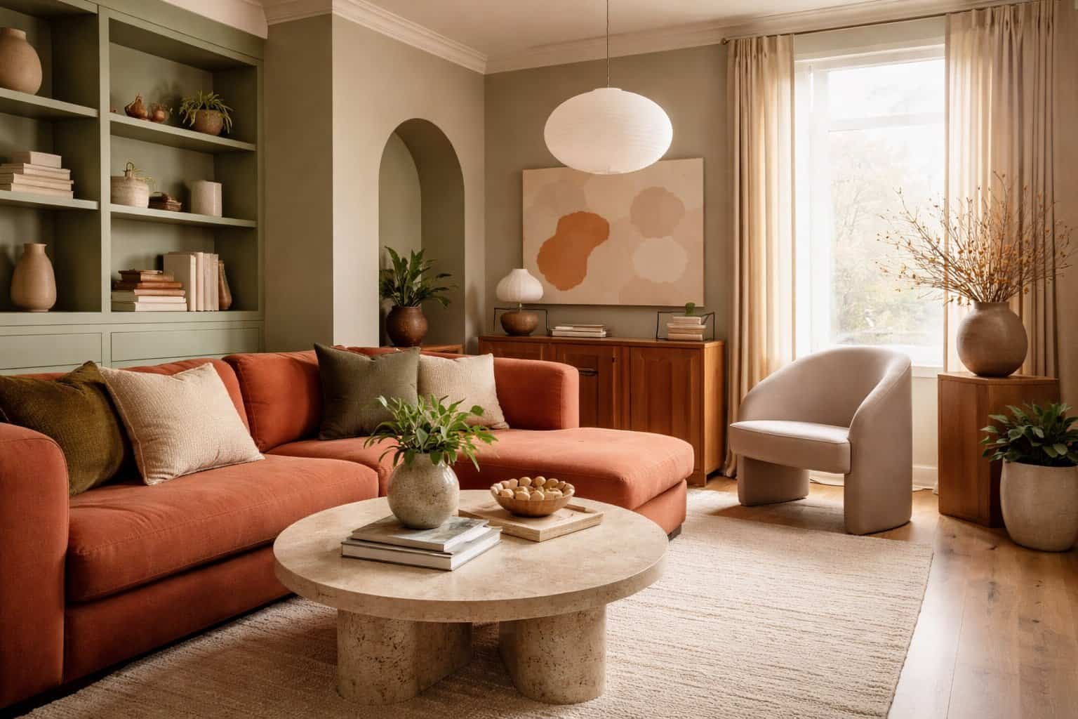
Visual Inspiration: Real-Life Room Color Décor Trends 2026
Seeing trends in action makes them easier to apply. Real homes are embracing 2026 colors in creative, livable ways.
Style Directions to Explore
- Modern minimalist: warm neutrals with subtle contrast
- Cozy contemporary: layered earth tones and soft textures
- Luxury-inspired: deep hues with metallic accents
- Nature-focused: green palettes with organic materials
Before-and-After Transformations
Many spaces are shifting from:
- Flat white walls → layered neutral palettes
- Cool gray tones → warmer, more inviting hues
- Minimal décor → textured, color-rich environments
How Designers Apply These Trends
Professionals often:
- Start with a neutral base
- Add depth through layering
- Introduce bold color in controlled ways
The result feels curated—not overwhelming.
The Future of Room Color Décor: What Comes After 2026?
Color trends continue to evolve, but certain patterns are already emerging beyond 2026.
What’s Likely Next
- More adaptive color palettes that shift with lighting
- Increased focus on sustainability and natural pigments
- Personalized color schemes driven by lifestyle and tech
Why Flexibility Matters
Rigid trends fade quickly. Flexible palettes allow you to:
- Update spaces easily
- Swap accents instead of repainting
- Keep your home feeling current longer
Homes are becoming more dynamic—and color plays a major role in that transformation.
FAQ: Room Color Décor Trends 2026
What are the most popular room color décor trends 2026?
Earthy neutrals, deep nature-inspired hues, and soft digital tones like lavender are leading the way, with a strong focus on warmth and comfort.
Is color drenching suitable for small rooms?
Yes, when done with the right shade and lighting, color drenching can actually make small spaces feel more cohesive and larger.
How do I choose the right color for my room?
Consider lighting, room size, and how the space is used. Always test samples before committing to a final color.
Are gray walls still in style in 2026?
Cool grays are fading, but warmer gray tones (like greige) remain popular when paired with complementary colors.
What is the easiest way to try new color trends without repainting?
Use accessories like cushions, rugs, artwork, and curtains to introduce new colors without a major commitment.
For deeper insights into how color influences mood and well-being in interiors, explore this helpful guide from Psychology Today:
https://www.psychologytoday.com/us/blog/the-athletes-way/202003/how-color-affects-our-moods
Your home doesn’t need a full makeover to feel new. Start small, experiment with color, and build a palette that reflects how you want to live.
If you’re ready to refresh your space, pick one trend from this guide and try it this week—you’ll be surprised how much color can transform everything.

I’m the creator behind EasyDecora, a home–decor lover who enjoys discovering simple, beautiful ways to make every room feel cozy and intentional. I share practical tips, creative ideas, and inspiration for anyone who wants to build a home they truly love.