
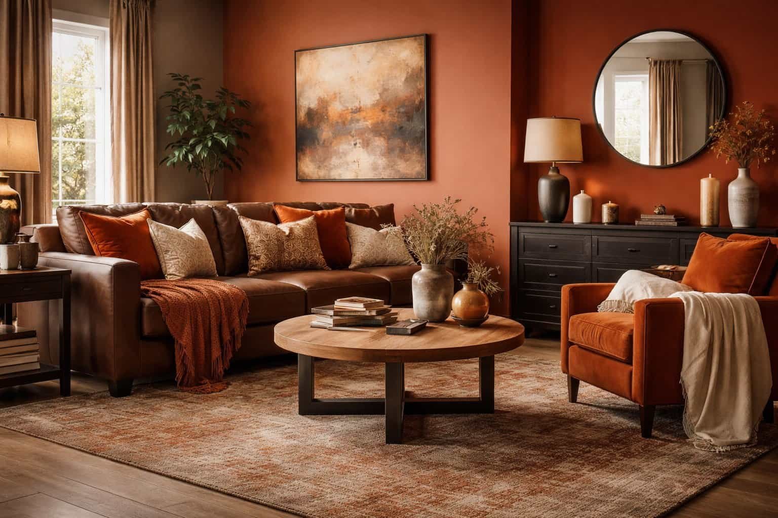

Burnt orange and brown living room decor has become a favorite among homeowners and interior designers who want warmth without sacrificing sophistication. This color combination feels grounded, inviting, and visually rich, making it ideal for spaces meant for relaxation and connection.
Burnt orange brings energy, creativity, and subtle boldness, while brown anchors the room with stability and comfort. Together, these hues create a living room that feels cozy yet intentional, dramatic yet balanced. Unlike trend-driven palettes that fade quickly, burnt orange and brown decor continues to feel relevant across seasons and design styles.
This guide explores how to use this palette thoughtfully, starting with why it works so well and how to choose the right shades to achieve a polished result.
In This Article
The Psychology Behind Burnt Orange and Brown Living Room Decor
Color psychology plays a major role in why burnt orange and brown living room decor feels so natural and appealing.
Burnt orange is associated with:
- Warmth and enthusiasm
- Creativity and social energy
- Comfort without visual aggression
Brown, on the other hand, represents:
- Stability and security
- Natural grounding inspired by wood and earth
- A sense of reliability and calm
When combined, these colors stimulate conversation while maintaining a soothing atmosphere—perfect for living rooms where people gather, unwind, and entertain.
How the Color Pairing Affects Mood
| Color | Psychological Effect | Impact in Living Room |
| Burnt Orange | Energizing and expressive | Adds warmth and focal interest |
| Brown | Grounding and calming | Creates a cozy, safe environment |
| Combined Effect | Balanced warmth | Encourages relaxation and connection |
Interior designers often describe this pairing as “emotionally warm but visually stable.” That balance explains why it works equally well in modern homes, rustic interiors, and eclectic spaces.
“Earth-based color palettes like burnt orange and brown help people feel more connected to their surroundings,” notes environmental color research frequently cited in interior design studies.
Choosing the Right Shades for Burnt Orange and Brown Living Room Decor
Selecting the correct shades is critical for successful burnt orange and brown living room decor. Poor undertone choices can make the room feel dated or heavy, while thoughtful selections elevate the entire space.
Best Burnt Orange Shades for Living Rooms
- Rust orange with red undertones for cozy depth
- Terracotta-inspired burnt orange for natural warmth
- Muted clay orange for modern interiors
Ideal Brown Tones to Pair With Burnt Orange
- Warm chocolate brown for furniture and accents
- Medium walnut brown for wood finishes
- Soft taupe-brown for walls and large surfaces
Shade Pairing Guidelines
- Deep burnt orange works best as an accent rather than a dominant wall color
- Medium browns prevent the space from feeling too dark
- Lighter brown neutrals create breathing room between bold elements
| Burnt Orange Shade | Best Brown Pairing | Recommended Use |
| Rust Orange | Walnut Brown | Accent walls, cushions |
| Terracotta | Chocolate Brown | Furniture, decor |
| Clay Orange | Taupe Brown | Textiles, artwork |
Design tip: Natural light strongly influences how these colors appear. Rooms with limited daylight benefit from lighter browns and muted burnt orange tones, while sunlit spaces can handle deeper, richer shades.
Burnt Orange and Brown Living Room Decor Color Balance Rules
Achieving visual harmony is essential when designing with burnt orange and brown living room decor. These colors are naturally warm and deep, so balance determines whether the space feels elegant or overwhelming.
The 60–30–10 Balance for This Color Palette
Interior designers often apply a modified version of the 60–30–10 rule when working with rich earth tones:
- 60% dominant color: Brown in walls, large furniture, or flooring
- 30% secondary color: Burnt orange through upholstery, rugs, or accent walls
- 10% accent shades: Neutrals like cream, beige, or soft metallics
This approach ensures burnt orange adds character without overpowering the room.
Preventing a Heavy or Dated Look
- Pair dark browns with lighter burnt orange tones
- Introduce contrast using off-white trim or light ceilings
- Mix matte and textured finishes to break visual density
Well-balanced burnt orange and brown living room decor feels layered, not flat.
Neutral Buffers That Improve Flow
- Warm white walls soften bold elements
- Beige and sand tones keep transitions smooth
- Subtle gray-brown shades modernize the palette
“Contrast is not about adding more color—it’s about letting each color breathe,” a principle frequently used in professional interior styling.
Walls and Paint Ideas for Burnt Orange and Brown Living Room Decor
Walls define the mood of any living space, making paint selection a major design decision in burnt orange and brown living room decor.
Burnt Orange Wall Applications
- Single accent wall behind the sofa
- Fireplace wall for visual emphasis
- Architectural niches or alcoves
Burnt orange works best when used strategically rather than across all four walls, preserving warmth without visual fatigue.
Brown Wall Treatments That Add Depth
- Soft mocha or taupe paint for full walls
- Wood paneling or slatted brown accent walls
- Textured finishes such as limewash or plaster
Brown walls pair beautifully with warm lighting, enhancing their natural richness.
Recommended Paint Finishes
- Eggshell or satin: Reflects light without glare
- Matte: Creates softness and depth
- Textured finishes: Add dimension and character
| Wall Color | Best Finish | Visual Effect |
| Burnt Orange | Matte | Cozy and grounded |
| Taupe Brown | Satin | Soft reflection |
| Chocolate Brown | Textured | Luxurious depth |
Design insight: Using lighter wall colors while introducing burnt orange through decor keeps the space adaptable for future updates.
Furniture Selection for Burnt Orange and Brown Living Room Decor
Furniture anchors the visual weight of burnt orange and brown living room decor, making thoughtful selection essential for comfort and cohesion.
Brown Furniture as the Foundation
- Brown leather sofas for timeless appeal
- Upholstered fabric sofas in mocha or cocoa tones
- Wooden coffee tables in walnut or oak finishes
Brown furniture establishes a neutral base that allows burnt orange accents to shine.
Incorporating Burnt Orange Furniture
- Accent chairs for visual interest
- Ottoman or bench seating
- Upholstered stools or poufs
Burnt orange furniture pieces work best when limited to one or two standout items.
Mixing Materials for Depth
- Leather paired with soft woven fabrics
- Wood combined with metal accents
- Smooth upholstery balanced with textured cushions
| Furniture Piece | Ideal Color | Purpose |
| Sofa | Brown | Visual anchor |
| Accent Chair | Burnt Orange | Statement piece |
| Coffee Table | Natural Wood | Balance and warmth |
Successful burnt orange and brown living room decor always feels intentional, not matched. Variation in texture and tone creates a space that looks curated rather than staged.
Textiles and Fabrics in Burnt Orange and Brown Living Room Decor
Textiles are where burnt orange and brown living room decor truly comes to life. Fabric layers soften strong color contrasts while adding comfort and visual depth.
Key Textile Elements That Work Best
- Cushions in burnt orange, rust, or patterned blends
- Throws in warm brown, caramel, or cream
- Curtains in neutral tones with subtle texture
Rather than matching everything, mixing complementary fabrics creates a lived-in, welcoming feel.
Best Fabric Choices for This Palette
- Velvet: Enhances richness and luxury
- Linen: Keeps the space breathable and natural
- Wool or knit: Adds warmth and tactile comfort
Layering Textiles for Visual Interest
- Combine solid burnt orange pillows with patterned brown cushions
- Use textured throws to break up smooth upholstery
- Repeat colors at least three times across the room for cohesion
| Textile Item | Recommended Color | Design Impact |
| Cushions | Burnt orange + brown | Color continuity |
| Curtains | Soft beige or taupe | Light balance |
| Throws | Caramel or rust | Cozy layering |
Styling note: Avoid overly shiny synthetic fabrics, which can cheapen the earthy sophistication of this color scheme.
Flooring and Rugs for Burnt Orange and Brown Living Room Decor
Flooring grounds the entire room, making it a critical component of burnt orange and brown living room decor.
Flooring Options That Complement the Palette
- Natural hardwood in walnut or oak
- Engineered wood with warm undertones
- Neutral stone or tile paired with layered rugs
Dark floors add drama, while medium wood tones keep the room feeling open.
Choosing the Right Area Rug
- Rugs with burnt orange accents tie the palette together
- Earth-toned patterns add character without overpowering
- Low to medium pile rugs suit high-traffic living rooms
Rug Placement Tips
- Front legs of furniture resting on the rug for unity
- Oversized rugs prevent a cramped appearance
- Layering a patterned rug over a neutral base adds depth
| Rug Style | Best Color Mix | Ideal Room Effect |
| Persian-inspired | Burnt orange + brown | Classic warmth |
| Geometric | Neutral + rust accents | Modern edge |
| Solid texture | Taupe or beige | Subtle grounding |
Strong flooring choices enhance the warmth without competing for attention.
Lighting Choices to Enhance Burnt Orange and Brown Living Room Decor
Lighting transforms how burnt orange and brown living room decor is perceived, influencing both mood and color accuracy.
Best Lighting Temperature
- Warm white bulbs between 2700K–3000K
- Avoid cool lighting, which dulls warm tones
- Dimmable fixtures allow flexible ambiance
Layered Lighting Approach
- Ambient lighting: Ceiling fixtures or recessed lights
- Task lighting: Floor lamps near seating areas
- Accent lighting: Table lamps highlighting decor
Fixture Styles That Complement the Palette
- Brass or bronze finishes for warmth
- Fabric lampshades in beige or cream
- Sculptural lamps that add visual interest
| Lighting Type | Recommended Style | Visual Effect |
| Floor Lamp | Bronze base | Soft glow |
| Table Lamp | Fabric shade | Cozy highlights |
| Pendant | Warm metal | Statement lighting |
Lighting insight: Proper illumination prevents brown tones from appearing flat and allows burnt orange accents to glow naturally.
Accent Decor and Accessories in Burnt Orange and Brown Living Room Decor
Accessories add personality and refinement to burnt orange and brown living room decor without requiring major changes. Thoughtful accents help reinforce the color palette while keeping the space visually engaging.
Decor Elements That Work Beautifully
- Ceramic vases in rust, clay, or chocolate brown
- Decorative bowls, trays, and sculptures in warm tones
- Candles and holders that add glow and texture
Small touches, when repeated strategically, make the design feel intentional rather than accidental.
Metallics That Complement This Palette
- Brass and bronze: Enhance warmth
- Antique gold: Adds subtle luxury
- Matte black: Provides modern contrast
Artwork and Wall Decor
- Abstract art featuring burnt orange highlights
- Nature-inspired prints with earthy undertones
- Woven wall hangings or wood-framed mirrors
| Accent Type | Best Color Choice | Purpose |
| Vases | Burnt orange | Visual pop |
| Trays | Brown or bronze | Functional decor |
| Artwork | Mixed earth tones | Focal interest |
Styling principle: Fewer, well-chosen accessories create more impact than cluttered displays.
Styling Burnt Orange and Brown Living Room Decor by Design Style
One reason burnt orange and brown living room decor remains popular is its versatility across design styles.
Modern and Contemporary Spaces
- Clean-lined brown sofas
- Burnt orange used sparingly through cushions or art
- Neutral walls to maintain a sleek look
Bohemian and Earthy Interiors
- Layered textiles and patterned rugs
- Natural wood and woven materials
- Rich burnt orange used generously
Rustic and Mid-Century Living Rooms
- Leather seating and wood furniture
- Burnt orange upholstery or accent chairs
- Warm metals and geometric shapes
| Design Style | How the Palette Is Used |
| Modern | Minimal accents |
| Bohemian | Layered and expressive |
| Rustic | Deep and cozy |
This palette adapts without losing its warmth or character.
Seasonal Styling Ideas for Burnt Orange and Brown Living Room Decor
Burnt orange and brown living room decor naturally aligns with autumn, yet it can look stunning year-round with subtle seasonal shifts.
Autumn and Winter Styling
- Chunky knit throws
- Deeper brown textures
- Warm ambient lighting
Spring and Summer Refresh
- Lighter fabrics like linen
- Soft beige or cream accents
- Reduced layering for airflow
Easy Seasonal Updates
- Swap cushion covers
- Change decorative accessories
- Adjust lighting intensity
Tip: Keeping core furniture neutral allows seasonal changes without redesigning the entire space.
Common Mistakes to Avoid in Burnt Orange and Brown Living Room Decor
Even strong palettes can fail without proper execution. Avoid these frequent pitfalls:
- Overusing dark brown without contrast
- Applying burnt orange too heavily on walls
- Ignoring lighting and natural light sources
- Matching everything instead of mixing textures
| Mistake | Better Approach |
| Too dark overall | Add lighter neutrals |
| Flat textures | Layer fabrics |
| Poor lighting | Use warm, layered lighting |
Balance, contrast, and texture prevent heaviness.
Final Thoughts on Burnt Orange and Brown Living Room Decor
Burnt orange and brown living room decor offers a rare combination of warmth, versatility, and timeless appeal. Rooted in nature-inspired tones, this palette creates spaces that feel inviting, grounded, and stylish without being overly trendy.
When applied thoughtfully—through balanced color use, layered textures, proper lighting, and curated accessories—this design approach transforms a living room into a place that feels both comforting and refined. Whether styled in a modern, rustic, or bohemian direction, burnt orange and brown consistently deliver depth and character.
Color theory research continues to support the emotional benefits of warm, earthy palettes in interior spaces, as highlighted by organizations such as the Color Association of the United States, a trusted authority in color trend analysis and application:
https://www.colorassociation.com

I’m the creator behind EasyDecora, a home–decor lover who enjoys discovering simple, beautiful ways to make every room feel cozy and intentional. I share practical tips, creative ideas, and inspiration for anyone who wants to build a home they truly love.